Brand Identity
Case Study 04 · 2025
RUMI
Designed for quiet focus, in everyday moments.
RUMI is a personal, one-week brand-identity exploration. The focus is the identity system itself; the physical applications, mobile screens, and a small scale model are included as brand extension studies — short exercises to show how the same visual language behaves across surfaces.

Graphic Design
UX / UI Extension
Illustration
Figma
Focus
Brand extension study
Identity carried across surfaces
ROLE
Solo Designer
Brand + UX/UI
Timeline
1 week
2025, personal sprint
Deliverables
Identity System
Logo · Palette · Type · Apps


Project overview — how a symbolic cat and soft blue tones visualize a space for calm focus.
01 / Overview
—— The Challenge
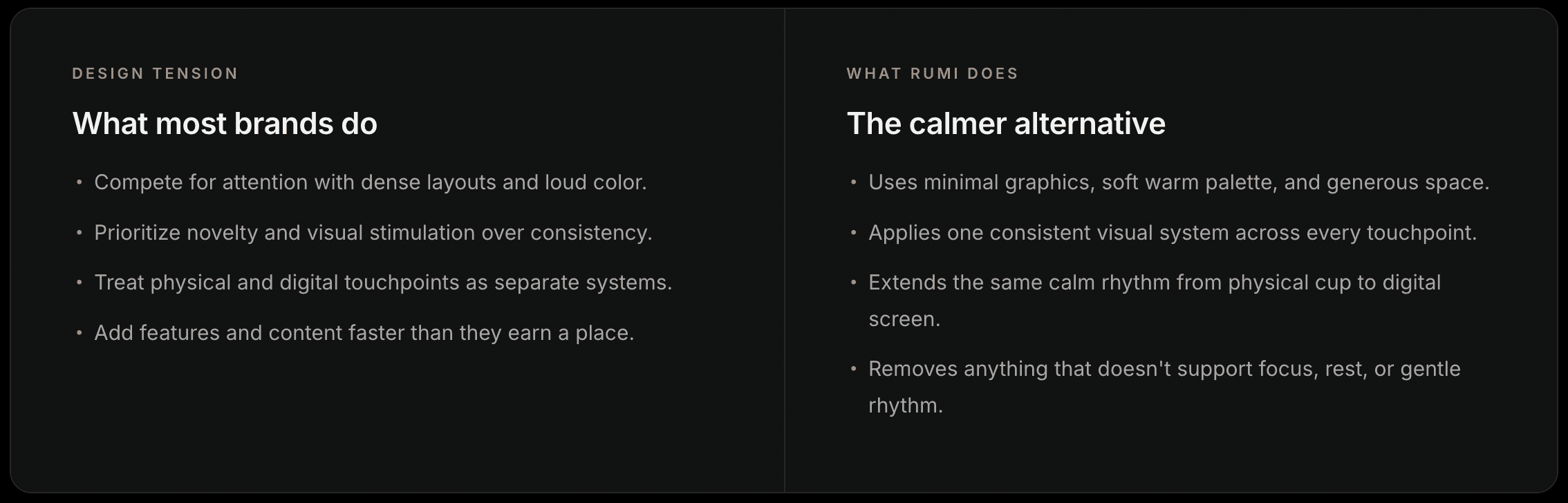
Most brands compete for attention. RUMI had to give it back.
Cafés, apps, and everyday interfaces increasingly compete for the same limited resource — the user's focus — through dense layouts, saturated color, and constant motion. The challenge for RUMI was to design a full brand system that supports concentration instead of interrupting it, and to keep that promise consistent across every touchpoint: a paper cup, a napkin, a mobile screen, and even a physical room.

Positioning — RUMI sits between café and lifestyle, anchored by quiet focus and calm productivity.
02 / Positioning
—— Brand Foundation ——
Four words that hold the whole brand together.
Every visual decision — from the weight of a letter to the color of a cup — was checked against these four keywords. If it didn't serve one of them, it didn't ship.


Brand concept board — the four keywords as they appear in the identity system.
03 / Concept
—— Identity System ——
A quiet visual language, built to be repeated.
Logo, color, and typography — three fixed variables that anchor every RUMI surface, from paper cup to mobile screen.



Logo system — primary wordmark, secondary lockups, and legibility guardrails.
04 / Logo

Color & type system — Pantone 729U + 2965C, paired with Aktiv Grotesk Thai, Helvetica, and Nanum Gothic.
05 / Color & Type
—— Physical Applications ——
The identity on objects a customer would actually hold.
Three core touchpoints — coffee cup, napkin, postcard — as a first check on whether the system holds together off the screen.


Mobile app extension — four core screens carrying the same calm rhythm into a digital surface.
06 / App

—— Applications ——
A short mobile study — the same visual language on a screen.
A four-screen brand extension exploring how RUMI’s palette, typography, and spacious visual rhythm could translate to a mobile café experience.

—— Reflection
RUMI started from a very small observation — how a calm cat can shift the mood of a room — and grew into a full identity system and a mobile app. The most useful lesson was about restraint: the temptation with a personal project is to add more, but the brand only started to feel like itself once I stopped adding and started removing. The version I kept is quieter than the first draft, and much more like the room it was trying to describe. Turning any of these into a real product would need its own project — user research, feature scoping, and validation — all of which are out of scope here.
Also explored
A 50 cm scale model of a RUMI book café.
Built as a side exploration — brick walls, hanging greenery, string lights, a circular reading nook, and a cat perched on the wall. Not a deliverable and not a proposal for a real space; a check on whether the room would still feel like RUMI without a logo in it.

—— Takeaway ——
What this project taught me.


01 · Welcome
Cat symbol, wordmark, and two soft CTAs — no marketing noise.
02 · Choose Your Cafe
Frequently Chosen, city search, and a map view — one screen, three ways in.
03 · My Cart
Order, promo code, total. Nothing else. Check out in one tap.
04 · Profile
Account, notifications, rewards — grouped calmly, never loud.
07 / Summary
Final overview — what the project set out to demonstrate.


