Client Work
Case Study 05 · 2026
LONE ONES
A fully responsive e-commerce site for a Los Angeles silversmith brand.
Client project through RemoteMountain. As the UI/Visual Designer, I delivered 14 responsive pages across desktop, tablet, and mobile — designed in Figma, then built out in Framer — for LONE ONES, the jewelry brand founded by Leonard Kamhout.

UI Design
Framer
E-commerce
Responsive Web
Deliverables
14 responsive pages
3 breakpoints, built in Framer
ROLE
UI / Visual Designer
Design + Framer build
Agency
RemoteMountain
Creative Intern, 2026
Timeline
~2 weeks
Summer 2026

—— Context
A luxury silversmith brand needed a site that felt as considered as the jewelry.
LONE ONES is a jewelry house founded by Leonard Kamhout, a Los Angeles silversmith whose work sits between craft tradition and subcultural iconography. The client came to RemoteMountain wanting a responsive e-commerce site that could carry that identity end-to-end — from a full-bleed hero to a checkout form — without diluting it. I joined as the UI/Visual Designer on the project.
What I owned
End-to-end UI design and Framer implementation for all 14 pages, across desktop, tablet, and mobile. This included the visual system (spacing, type scale, component library), the interaction states, and the responsive behavior on every page.
What I did not own
Brand identity, logo, product photography, and copy — all supplied by the client. Backend, commerce logic, and final launch decisions sat outside my scope; I delivered a production-intent Framer site to the agency.

—— Scope ——
Fourteen pages, three breakpoints, one system.
The main design challenge wasn't any single page — it was keeping the identity consistent across a full e-commerce flow at three widths, while staying build-ready in Framer.

—— Brand Direction ——
Letting the product carry the room.
The visual language was inherited from the brand — I didn't design the identity, I translated it. My job was making sure the digital surface stayed out of the jewelry's way.
A monochromatic palette, oversized type, generous negative space.
Deep black backgrounds, high-contrast silver type, and full-bleed product imagery. The site borrows the same restraint the client uses in physical retail: nothing on the page unless the product benefits from it.
I paired the brand's display face (used only for the LONE ONES wordmark and headers) with a neutral sans for body copy, so the display type never has to compete with functional text.

Luxury
Minimal
Editorial
Craftsmanship
Dark
—— Responsive Experience ——
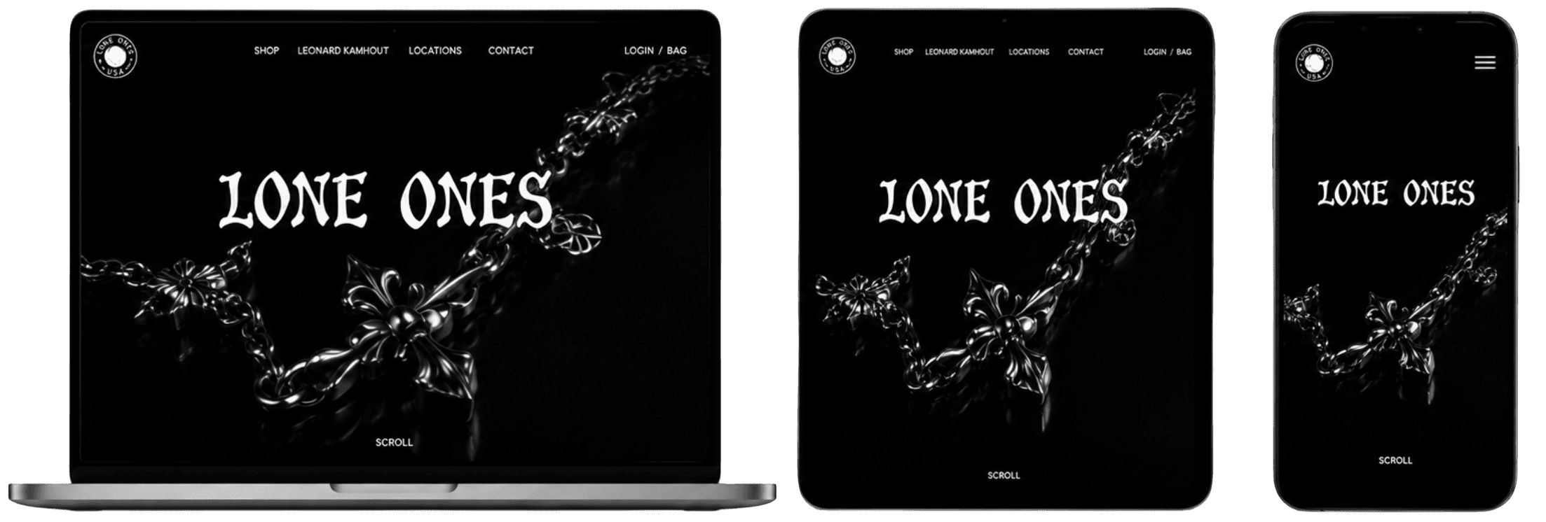
Designed for every width, not just resized to fit.
Each of the 14 pages was designed against three breakpoints — desktop, tablet, mobile — with the composition adjusted per width, not just the container.
Desktop
Mobile
Tablet
—— Selected Screens ——
Four pages that carry the shape of the site.
Home, Shop, Product Detail, and About — the four surfaces the identity has to survive on. If these hold, the rest of the flow does too.
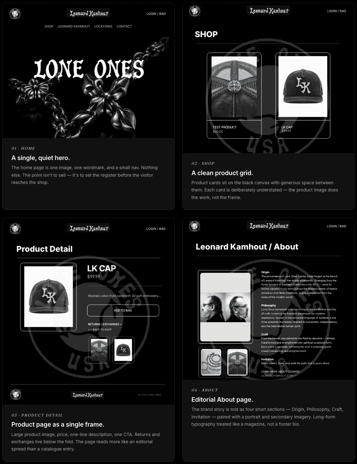


Home page — desktop composition, full width.
01 / Home · Desktop
—— Supporting Pages ——
The other ten pages — the quiet ones that carry the flow.
Auth, account, cart, checkout, locations, contact, error states. These are the pages that decide whether the site actually functions — they had to stay on-brand without ever getting in the user's way.

—— Process
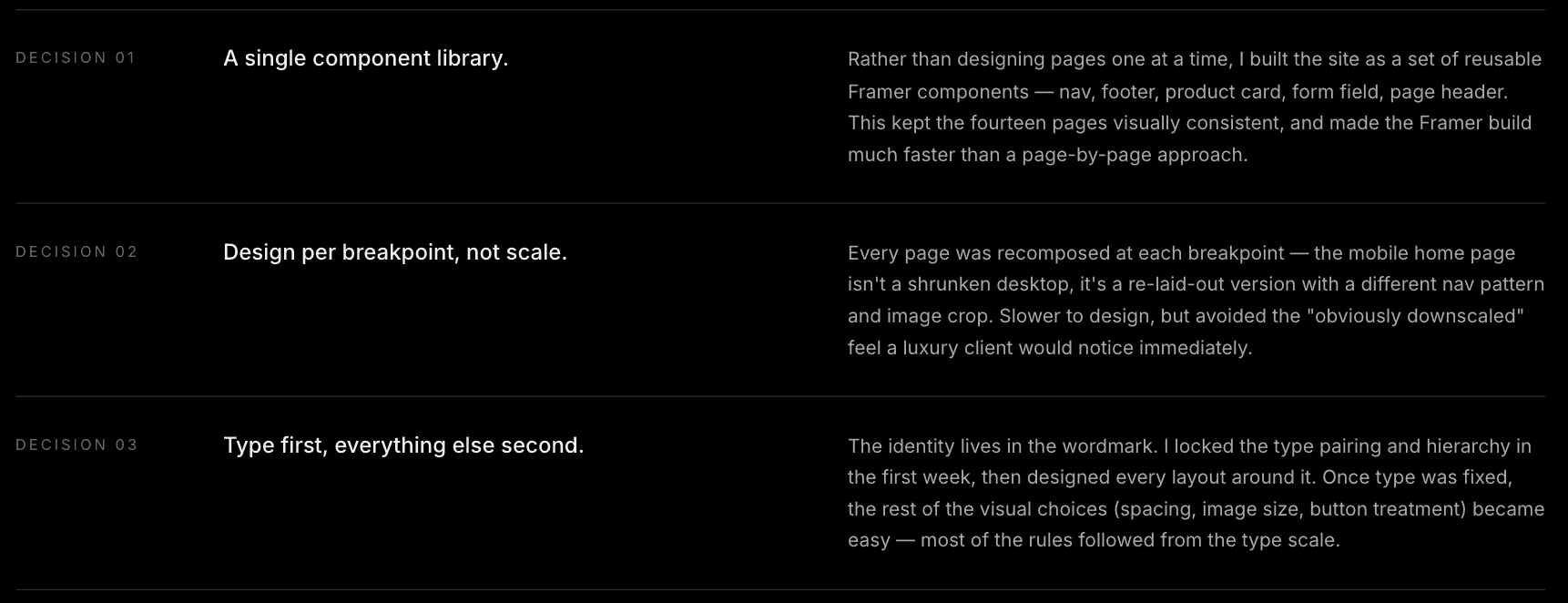
Three decisions that shaped the whole site.
On a client project this size, most of the design work is small structural choices repeated across every page. These are the three that mattered most.
—— Takeaway ——
What this project taught me.

—— Reflection
This was my first end-to-end responsive site as a designer and as the person building it, and the biggest lesson was how much design work happens after Figma. Roughly half of the useful decisions on this project were made while implementing in Framer — spacing that read fine on a static frame stopped reading fine once the page actually scrolled; a button that looked right at 1440 fell apart at 1024. Doing both sides forced me to design for the medium, not for the frame.
If I did it again, I'd invest earlier in the component library — I ended up rebuilding a few components partway through when I realized the same pattern was recurring on pages I hadn't planned for. The next client project I take on, I'll spend the first week on the system, and only then start touching pages.

