
Impact
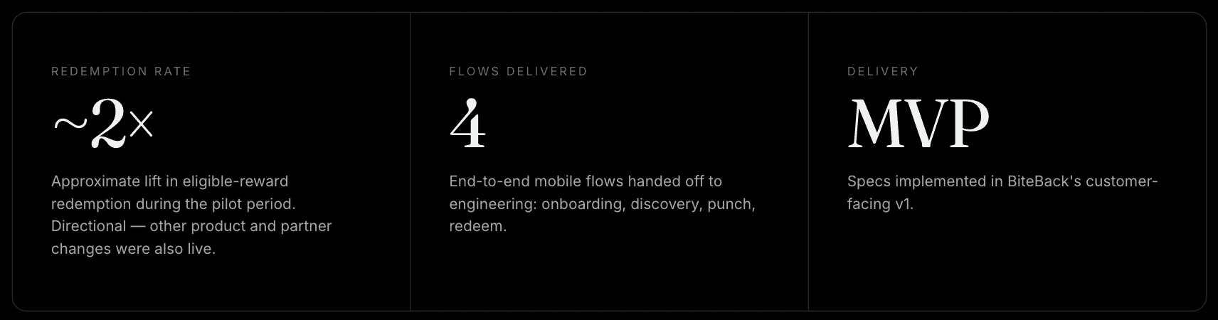
20% → 40%
Redemption, pilot period
ROLE
UI/UX Designer Intern
Sole designer on rewards
Timeline
3 months
2025, MVP sprint
Team
7-person startup
PM · Eng · Design
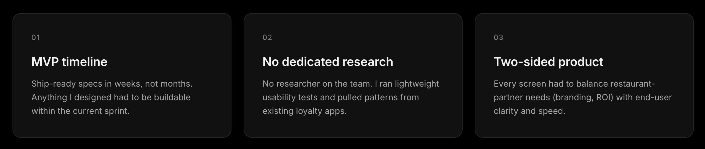
—— Insights ——
Three findings shaped every decision after this point.

—— Outcome ——
A directional product outcome, honestly reported.
During the observed pilot period, the share of eligible rewards redeemed increased from approximately 20% to 40%. Because product, partner, and marketing changes occurred during the same period, I treat this as a directional outcome the redesign contributed to rather than a controlled attribution.
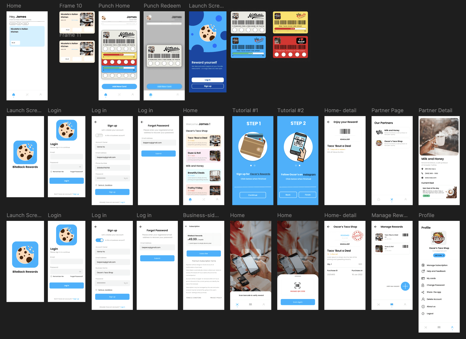
—— Final Designs ——
Four end-to-end flows delivered to engineering for the customer-facing MVP.
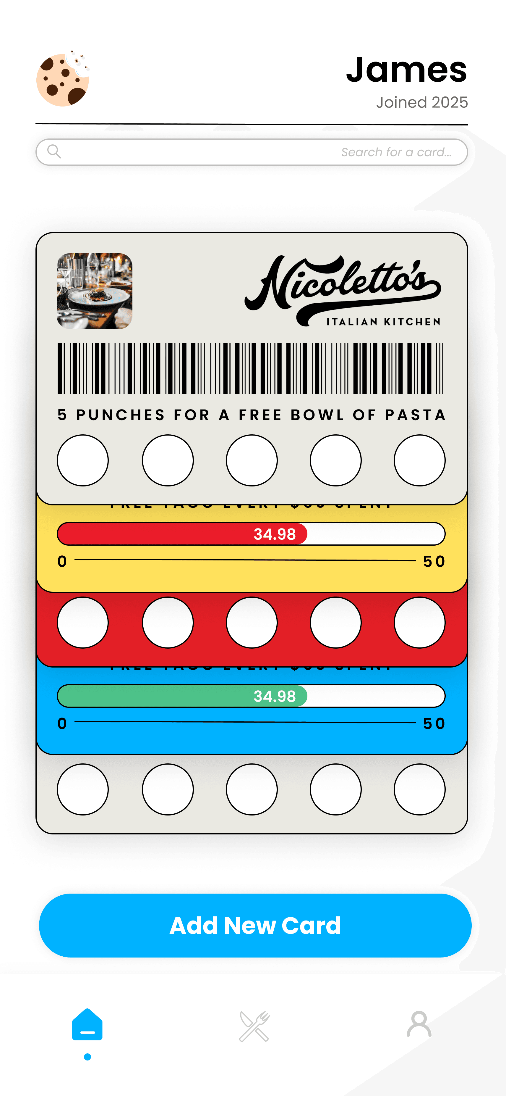


04 Punch card — visual progress replaces abstract point tallies.
05 Reward earned — a clear preview before commit.
06 Redeem — one-tap barcode, staff-scan, done.
—— Reflection
This project taught me that reducing hesitation can be as valuable as adding functionality. Making progress visible and outcomes predictable helped turn an abstract rewards system into a clearer, more actionable experience.

—— Findings → Decisions ——
Three observations from the audit, and what I changed because of each.
Findings came from a walk-through of the existing app plus founder interviews. Each finding is paired with the specific design decision it drove and the reason the decision was made — written out here rather than buried inside a mockup.
—— Iterations
From 40+ frames explored to a focused set delivered to engineering.
I moved from wireframes to mid-fi to final in weekly cycles, reviewing with engineers on feasibility and with the founders on business fit. Punch-card visuals went through four rounds before landing on a version that felt both branded and buildable within the sprint.

—— EXISTING EXPERIENCE
The old flow buried rewards two taps deep.
Before designing anything new, I walked the existing app end-to-end and
mapped where users were losing momentum. Three moments stood out.
Discover partners → view current deal → track progress and redeem.
For Diners
Subscribe → configure rewards → manage the storefront from one place.
For Restaurant Owners


—— Two-Sided Design
One product, two audiences, two coherent flows.
Alongside the customer app, I designed a parallel business flow for
restaurant owners — subscription, home, deal tracking, and profile.
Both sides share the same visual system so partners feel the product is one thing, not two.


